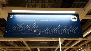
BD example: wayfinding signage at IKEA
On my latest visit to my local IKEA store, I noticed this elaborate wayfinding sign. It represents the whole route through the shop as one long line, but also shows bypasses. Every area is numbered and labeled. The main areas, such as the restaurant have a seperate logo for easy recognition. Clever, but complex. It took me some time to figure out and I had to make some backtracks still. What do you think?
Follow us on Instagram for more examples of behaviour design!
1,367 people read this
COPYRIGHT 2017 BEHAVIOUR.DESIGN. NO MOOCHING, PLEASE.


Leave a Reply